Make a responsive carousel with just CSS
3 Jan 2024Nowadays, with modern CSS it's incredibly easy to create a carousel. Where you had to rely on JavaScript to calculate the exact position of you carousel items on your screen, now all you have to do is create a container with overflowing content and change the scroll mode.
What is a carousel?
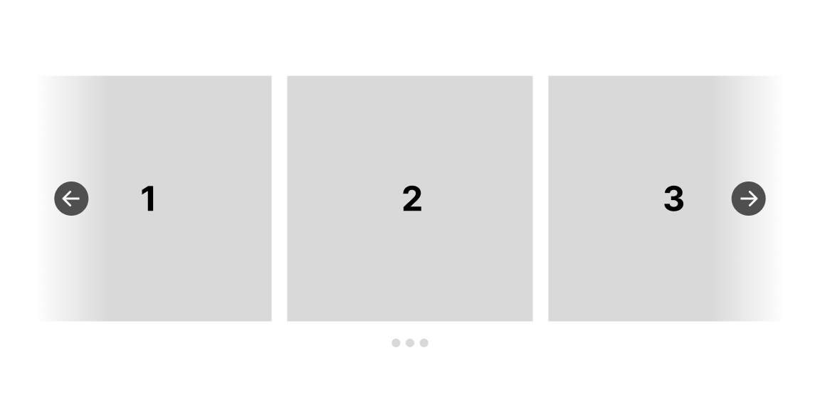
A carousels is an interactive slider that showcases multiple items. These items can be anything. A common use case is images or card components. A carousel lets you show a selection of these items on screen. Through interacting with it, it will show other items that were hidden before.
I personally needed to implement it for the orientation content of our Polarsteps guides:
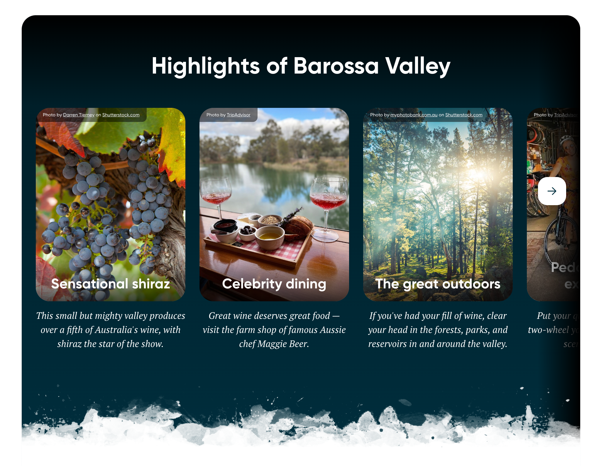
See it live in action here (scroll a bit down and see the carousel in the "Visiting the Barossa Valley for..." section in action too)!
Other potential use cases of image carousels are:
- Related items in a webshop
- Rotating through news items
- Image slider for product images
JavaScript implementation
To implement an image carousel up until just a couple of years ago you needed JavaScript. An implementation would include absolute positioning items inside a container using css. Then calculating the carousel wrapper size and item sizes in realtime using JavaScript. And then add interactions by either updating the left or right values or updating the transform value using JavaScript again. This leaves you with a very basic implementation of the carousel. Did you wish for any form of swipe interactions on a phone you'd probably better of by reaching to an external library.
So, how does this work with CSS only?
I was happy to find out that this is much easier nowadays. By using CSS scroll snap you wont need any external library or fancy JavaScript code to reproduce most of the carousel functionality.
Start by creating a HTML list with items that will function as your carousel wrapper and carousel items:
<ul class="list">
  <li class="item"><div class="content">Item 1</div></li>
  <li class="item"><div class="content">Item 2</div></li>
  <li class="item"><div class="content">Item 3</div></li>
  <li class="item"><div class="content">Item 4</div></li>
  <li class="item"><div class="content">Item 5</div></li>
</ul>
Then for the core behaviour:
- apply
scroll-snap-typeto the wrapper with a value ofmandatoryfor the axis you want the scroll snapping to happen. - apply
scroll-snap-alignto the items with a value ofcenterto make sure the browser will align the active item to the center of your wrapper.
After including some styles to add spacing between and around the carousel and its items it will result in something like this:
.list {
  display: flex;
  gap: 8px;
  padding: 16px;

  list-style: none;
  overflow-x: scroll;
  scroll-snap-type: x mandatory;
}

.item {
  flex-shrink: 0;
  width: 80%;
  height: 90vh;

  background-color: #FFF;

  scroll-snap-align: center;
}

.content {
  display: flex;
  align-items: center;
  justify-content: center;
  height: 100%;

  font-family: sans-serif;
  font-size: 64px;
  font-weight: bold;
}
The result in the browser:
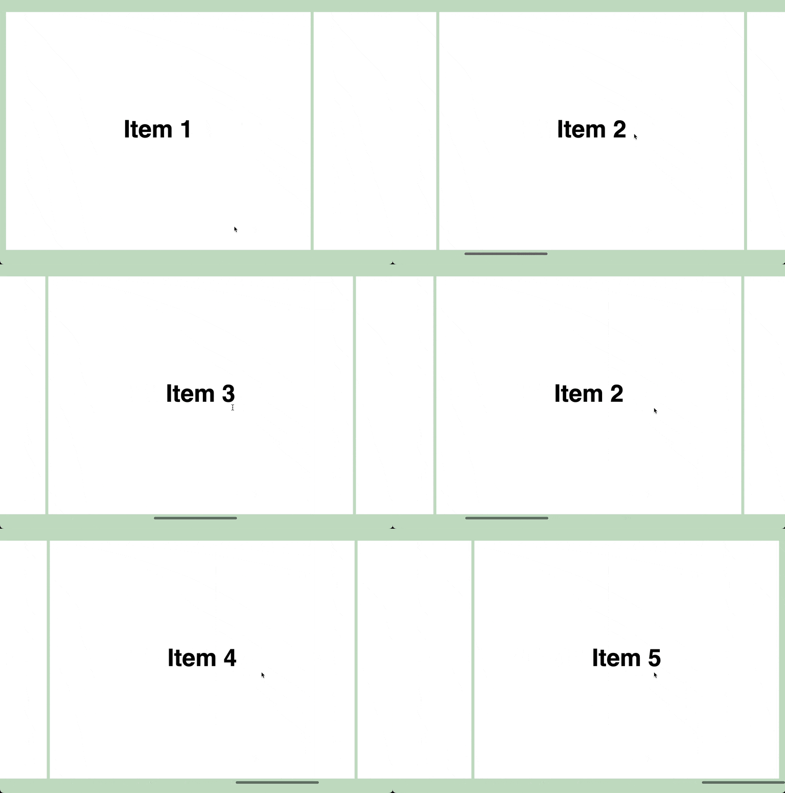
The coolest part is that this works using swipe guestures too. Make sure to test this in a browser on your mobile phone to feel how natural it feels!
Extras
Now that we have the core behaviour implemented in such a short amount of time we can focus and put our time in adding functionality according to our requirements!
Hide the scrollbar
Even though on most browsers nowadays scrollbars are not as intrusive as they used to be, you might want to hide them for a carousal. We can do that by applying a few lines of CSS to our list element:
.list {
  /* ... */

  /* Hide scrollbar in Firefox */
  scrollbar-width: none;

  /* Hide scrollbar in IE and Edge */
  -ms-overflow-style: none;
}

/* Hide scrollbar in webkit */
.list::-webkit-scrollbar {
  display: none;
}
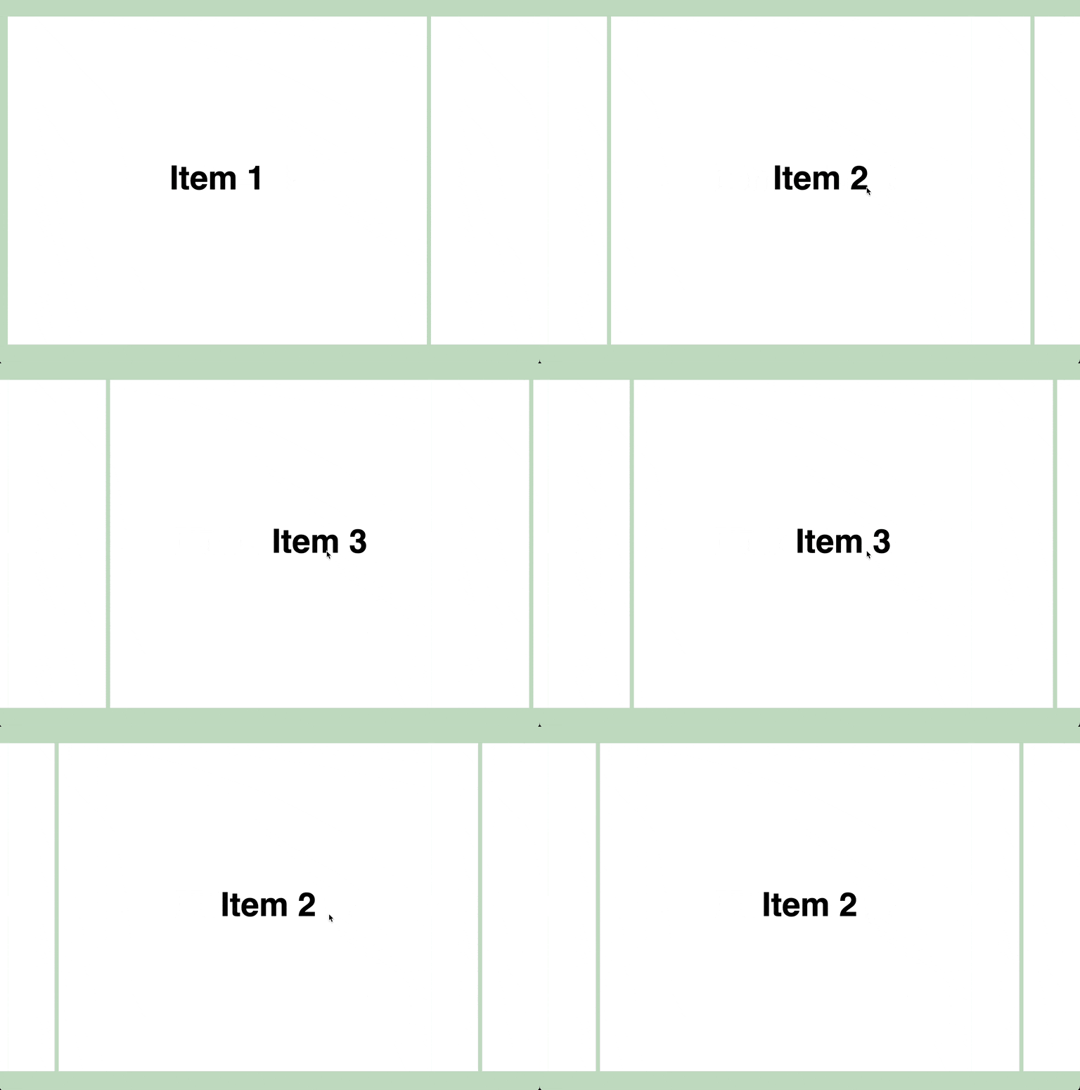
Now the scrollbar will be hidden:
Arrow buttons
For a better user experience you can add arrow buttons to your carousel. They will help by giving an indication to your user that there is more content to see. This is were we have to cheat a bit, because we'll need a tiny bit of JavaScript.
First add the buttons to the HTML and style them. I chose to keep it extremely simple for the purposes of this blog post.
<div class="list-wrapper">
  <ul class="list">
    <li class="item"><div class="content">Item 1</div></li>
    <li class="item"><div class="content">Item 2</div></li>
    <li class="item"><div class="content">Item 3</div></li>
    <li class="item"><div class="content">Item 4</div></li>
    <li class="item"><div class="content">Item 5</div></li>
  </ul>
  <button class="button button--previous" type="button">➜</button>
  <button class="button button--next" type="button">➜</button>
</div>
.list-wrapper {
position: relative;
}
.button {
position: absolute;
top: 50%;
width: 3rem;
height: 3rem;
transform: translateY(-50%);
}
.button--previous {
left: 1.5rem;
transform: rotate(180deg);
}
.button--next {
right: 1.5rem;
}Now we have two simple arrow buttons floating on the left and right side of our carousel.
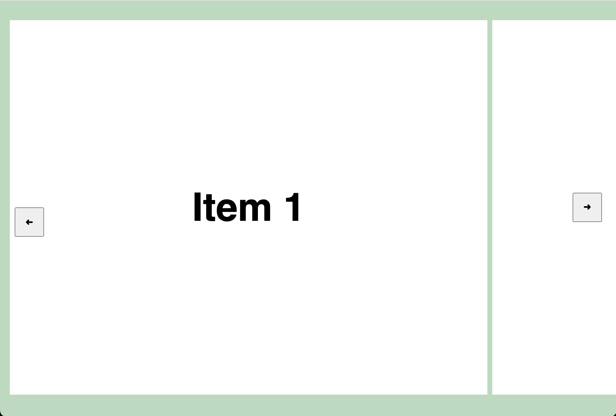
The next thing we want to do is to execute some JavaScript when these buttons are clicked.
<div class="list-wrapper">
  <ul class="list">
    <li class="item"><div class="content">Item 1</div></li>
    <li class="item"><div class="content">Item 2</div></li>
    <li class="item"><div class="content">Item 3</div></li>
    <li class="item"><div class="content">Item 4</div></li>
    <li class="item"><div class="content">Item 5</div></li>
  </ul>
  <!-- We're calling `handleClick` with a direction argument when the buttons are clicked -->
  <button onclick="handleClick('previous')" class="button button--previous" type="button">➜</button>
  <button onclick="handleClick('next')" class="button button--next" type="button">➜</button>
</div>
<script>
  const list = document.querySelector(".list");

  // We want to know the width of one of the items. We'll use this to decide how many pixels we want our carousel to scroll.
  const item = document.querySelector(".item");
  const itemWidth = item.offsetWidth;

  function handleClick(direction) {
    // Based on the direction we call `scrollBy` with the item width we got earlier
    if(direction === "previous") {
      list.scrollBy({ left: -itemWidth, behavior: "smooth" });
    } else {
      list.scrollBy({ left: itemWidth, behavior: "smooth" });
    }
  }
</script>
There's a few things going on here.
We want to decide by how many pixels we want the scroll container to be scrolled. In this example we do this by getting the width of the first item and using that number as the amount of pixels to scroll to. You can also use a static number here. In the Polarsteps implementation that I linked at the start of this article we use a static number (`150`). We found that it worked for all screen sizes, so no need to add extra functionality to get item sizes every time the screen or the scroll container changes size.
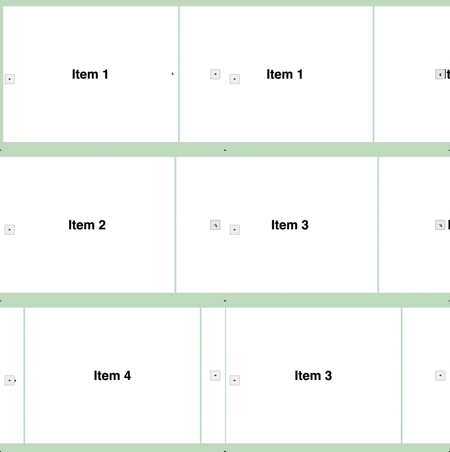
When calling `scrollBy` we pass `"smooth"` as value to the `"behaviour"` option. This tells the browser to smoothly scroll the amount of pixels we pass to the `left` option. Then `scroll-snap` takes over and makes sure the item is aligned nicely in the center.
The result:
More ideas
Talking about more functionality. Here is a list of ideas that you could add to this carousel:
- Automatic rotation
- Dots or thumbnails to scroll to using `scrollIntoView`
- Hide arrows on mobile devices
- Hide or disable arrows when there is no more items to scroll to
- Add shadows or other styling to indicate the start and end of the carousel
Conclusion
That's it! That's all that's needed to create an image carousel with basic behaviour nowadays! Ofcourse, there is a lot more functionality that you could implement (see the ideas section), but I think it's incredible that we can achieve this nowadays in just a couple lines of HTML, CSS and JavaScript.
If you want to see the Polarsteps image carousel implementation live in action make sure to check it out here.
If you liked this article and want to read more make sure to check the my other articles. Feel free to contact me on Twitter with tips, feedback or questions!